
Overview
For this UI/UX redesign project, I applied a user-centered design approach to make the app looks appealing and more intuitive by conducting user research and usability testing, creating an alternative user flow, and applying flat UI style with the brand accent color.
Problem Analysis
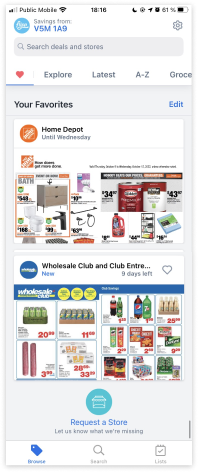
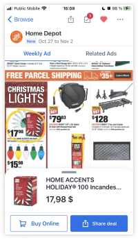
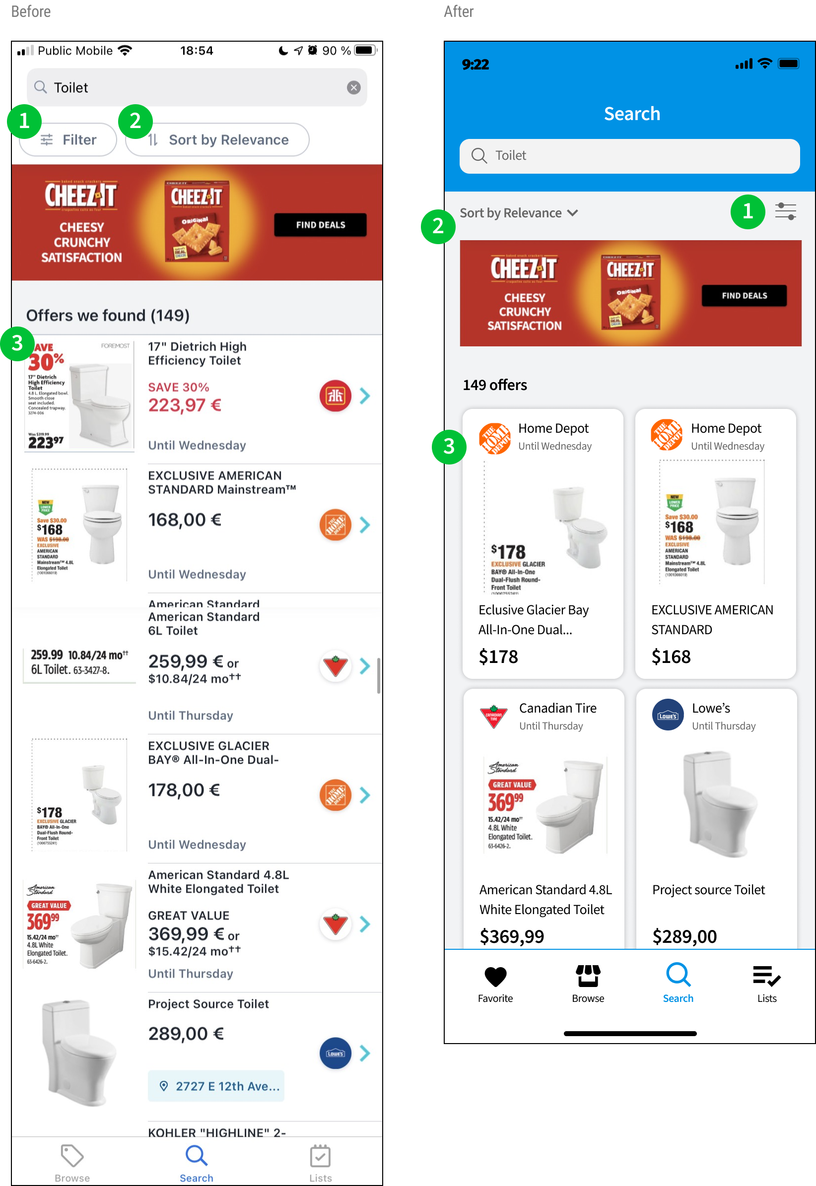
- The overall screen looks busy due to the number of store icons, inconsistent and illegible flyers
- Flyers are too small to read while browsing the stores
- The category slider below the search field has too many things to select: It makes the users have to swipe very far to find what they’re looking for. (favorite, explore, latest, A-Z, groceries, etc.)
- The “savings from postcode” on the top is redundant since the users can change or view it in the settings
- Font scale has no hierarchy which causes users to lose focus
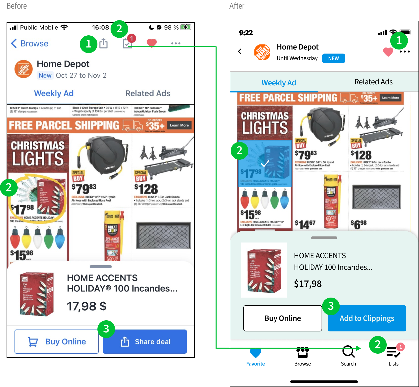
- Too many icons on the top of the screen
- “Share deal” button and the icon on the top is repeated
- The yellow marked circle is hard to see while selecting the item
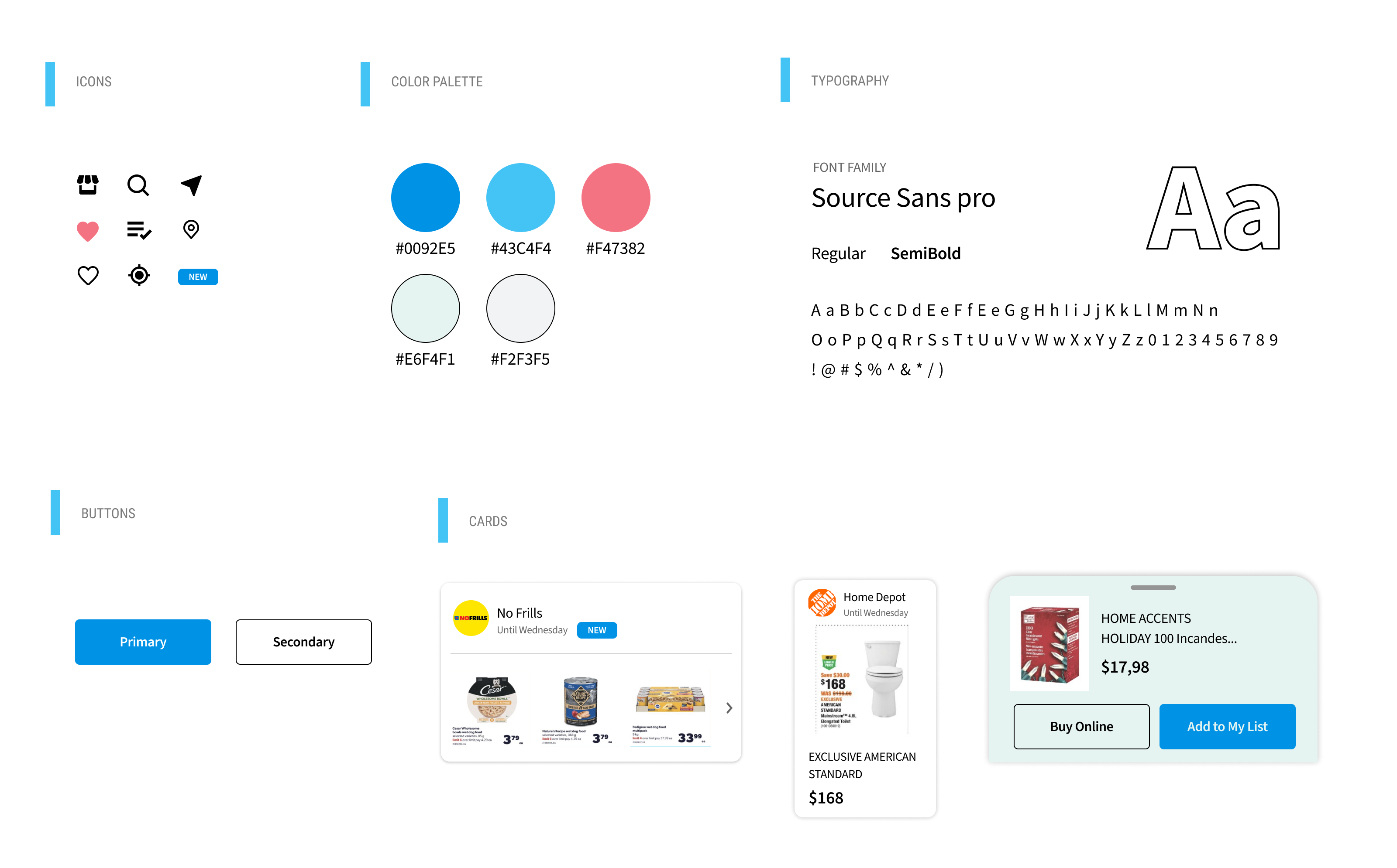
UI kit
User Flow – Current VS Alternative
Current
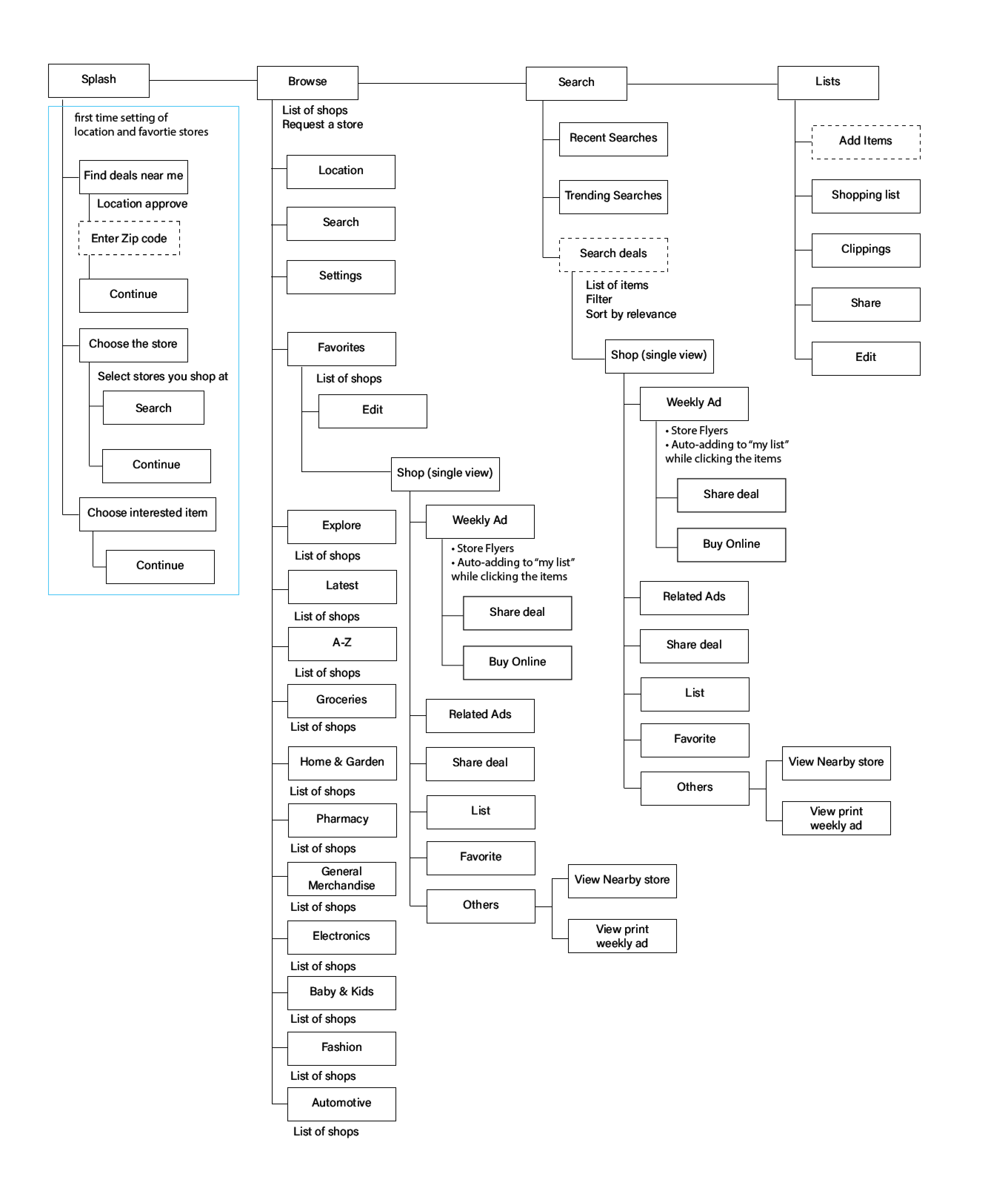
Alternative
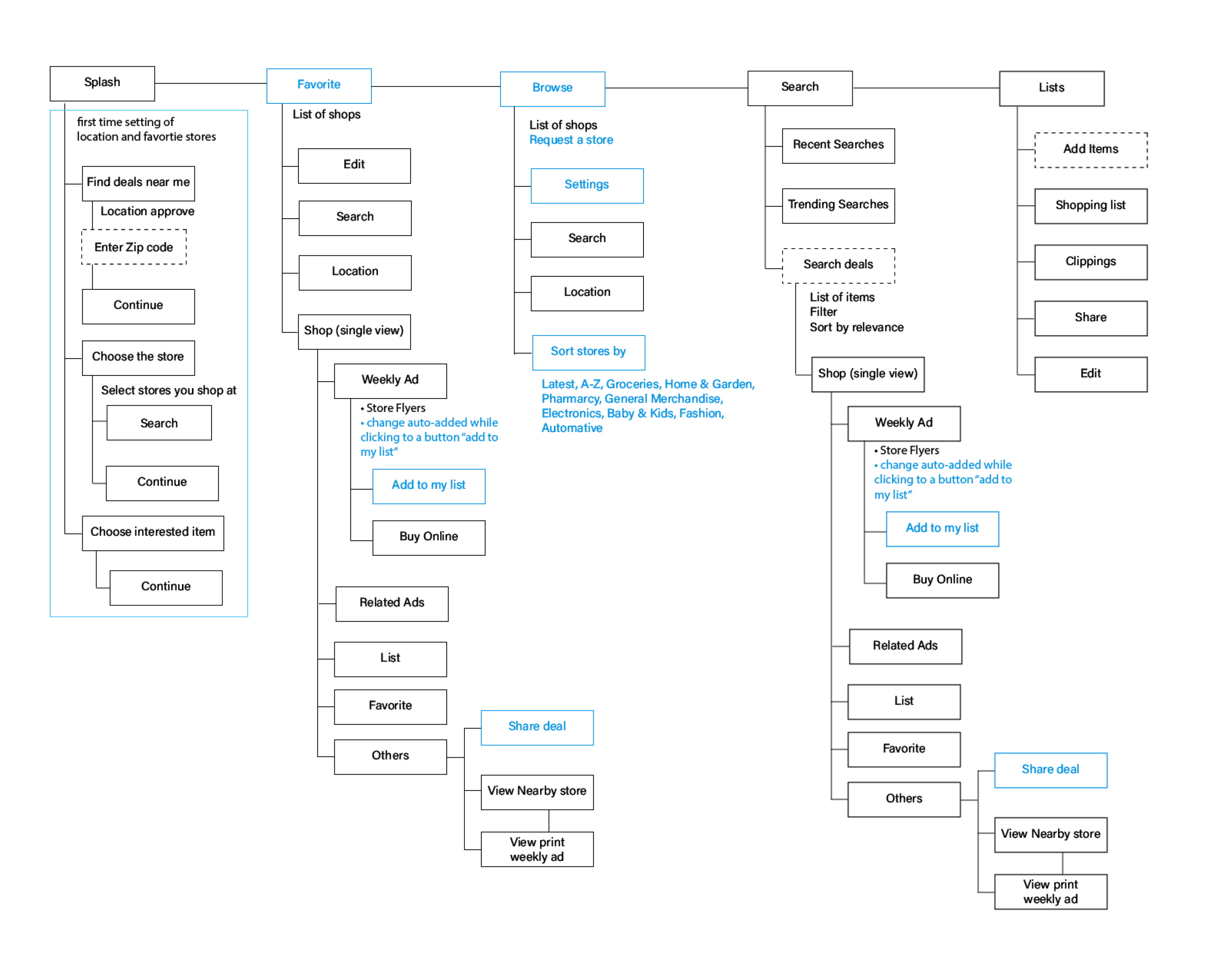
Wireframe
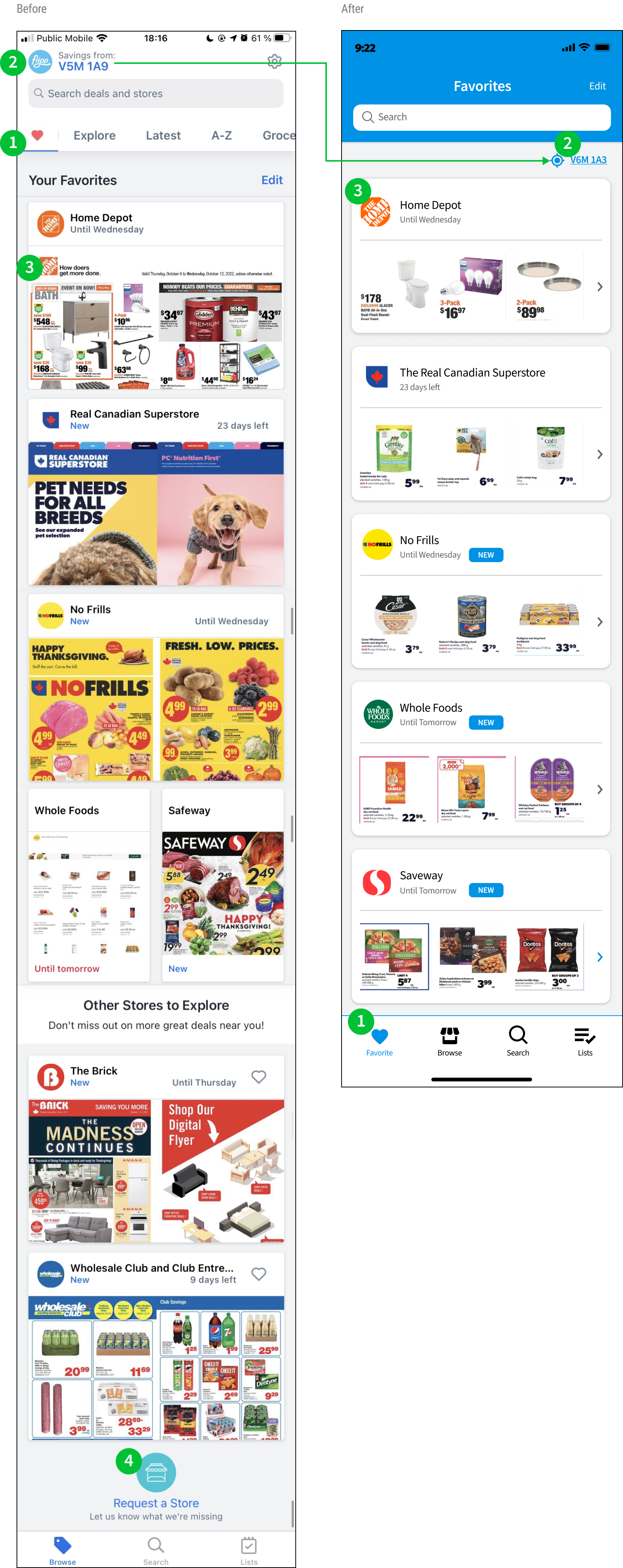
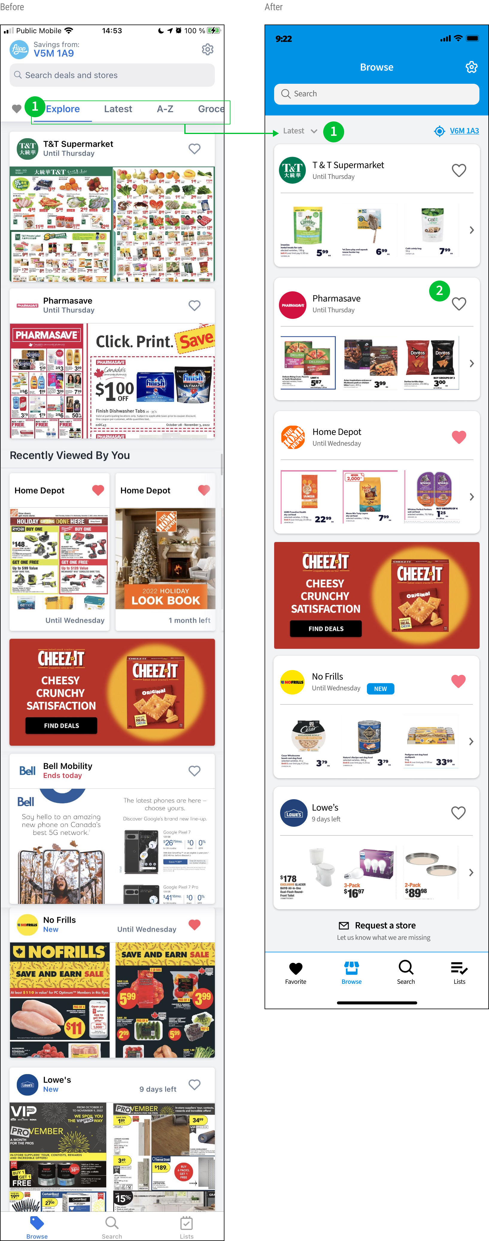
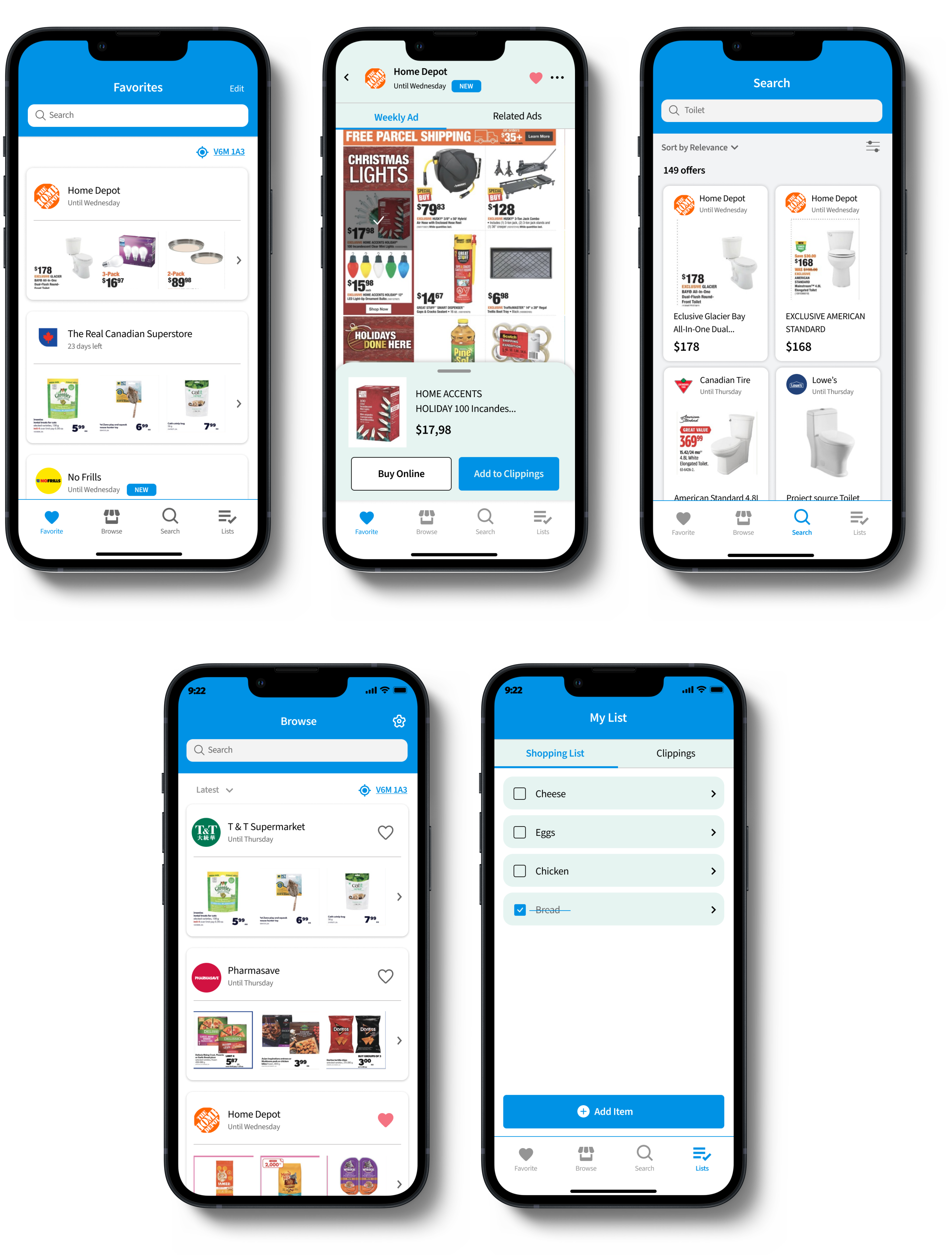
Current and Alternative design
Home

Browse
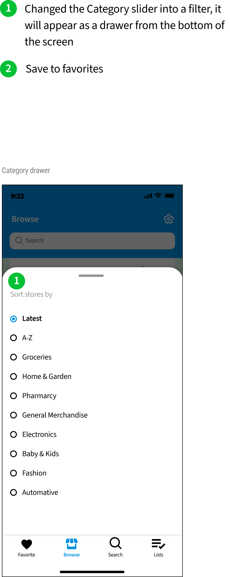
Search

Store single view

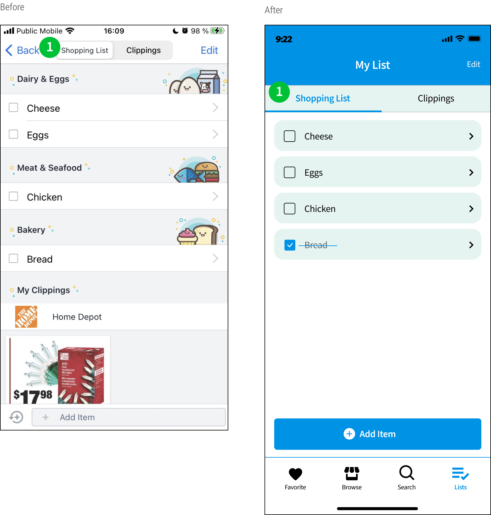
List

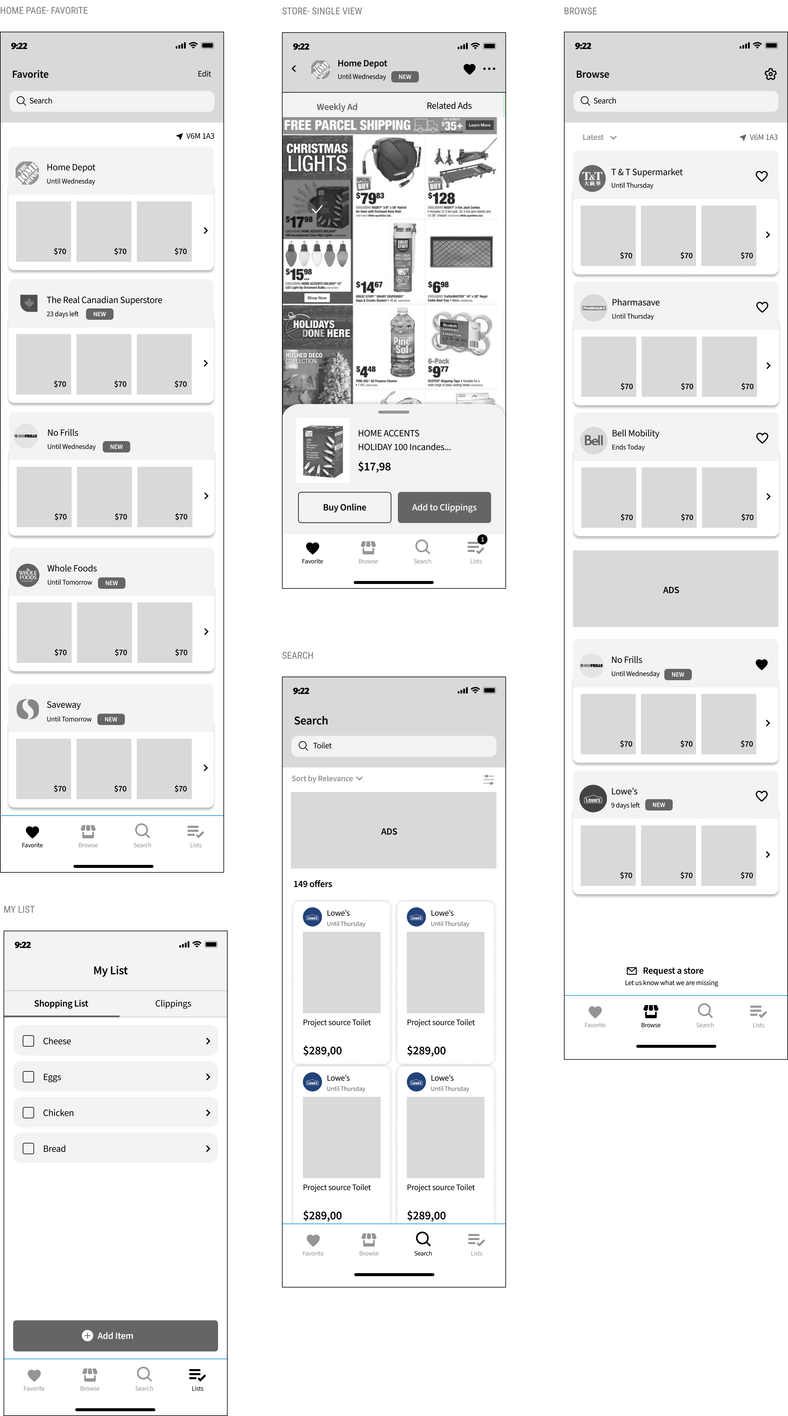
Mockups
Leave a Reply