
BC Wildfire Mobile App Case Study
Overview
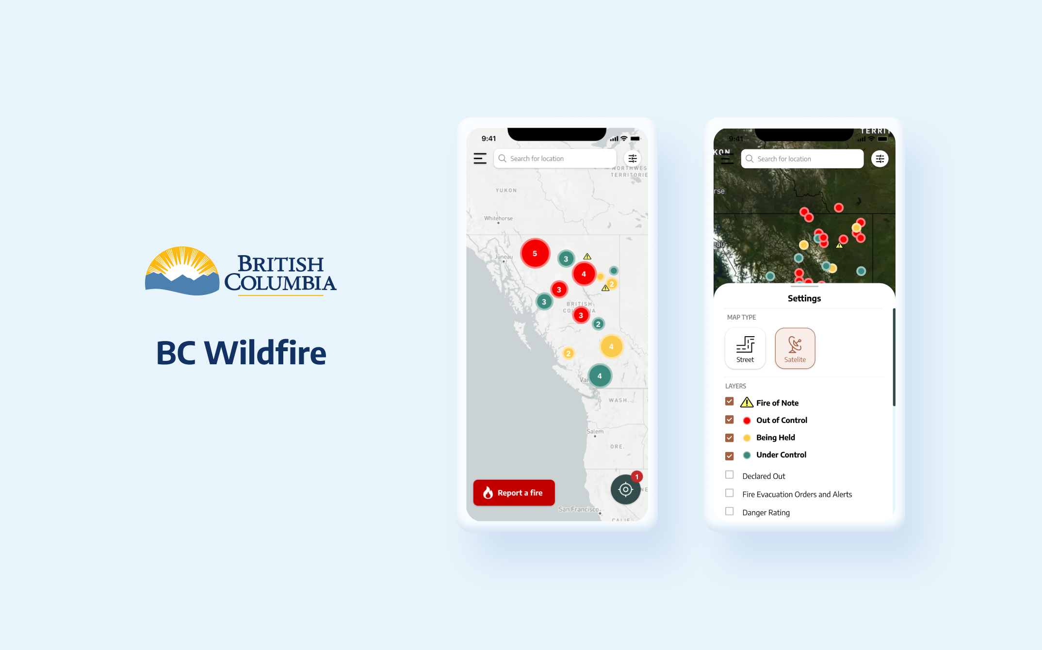
This case study focuses on the UI and UX redesign of BC Wildfire app. Over a span of two weeks, I dedicated my efforts to various aspects of the project, including thorough wireframing, prototyping, usability testing, and the creation of a new branding and UI kit.
About the app
BC wildfire is an app that allows users to understand the situation of the wildfire around them. The app’s map feature offers a range of data, such as wildfire status, current weather conditions, smoke forecasts, and the ability to search for nearby wildfires. Users can also report fires they encounter.
Problem analysis
UI
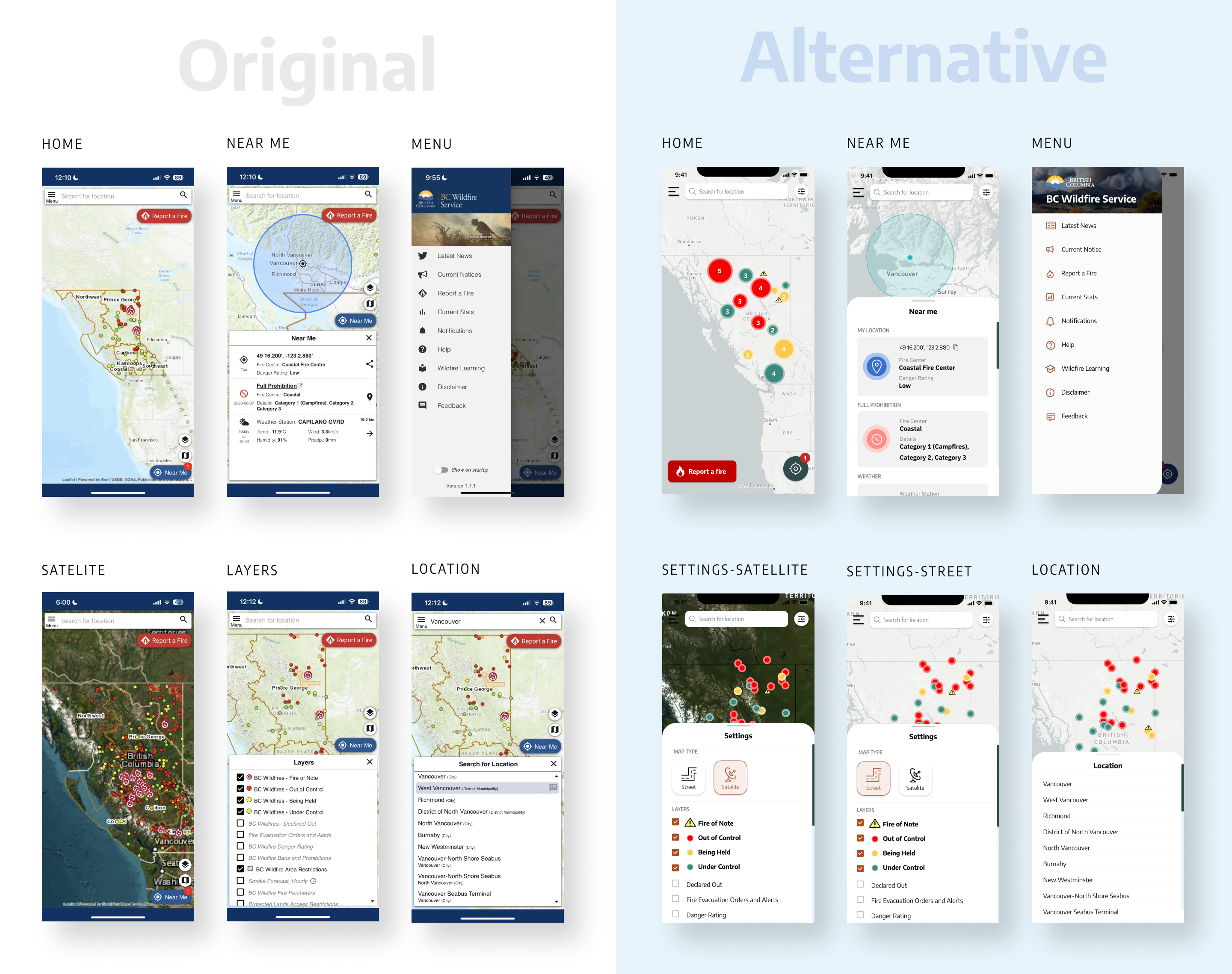
Map legend
- Style: The style of Wild fire of note is confusing, I changed it to a more recognizable warning symbol.
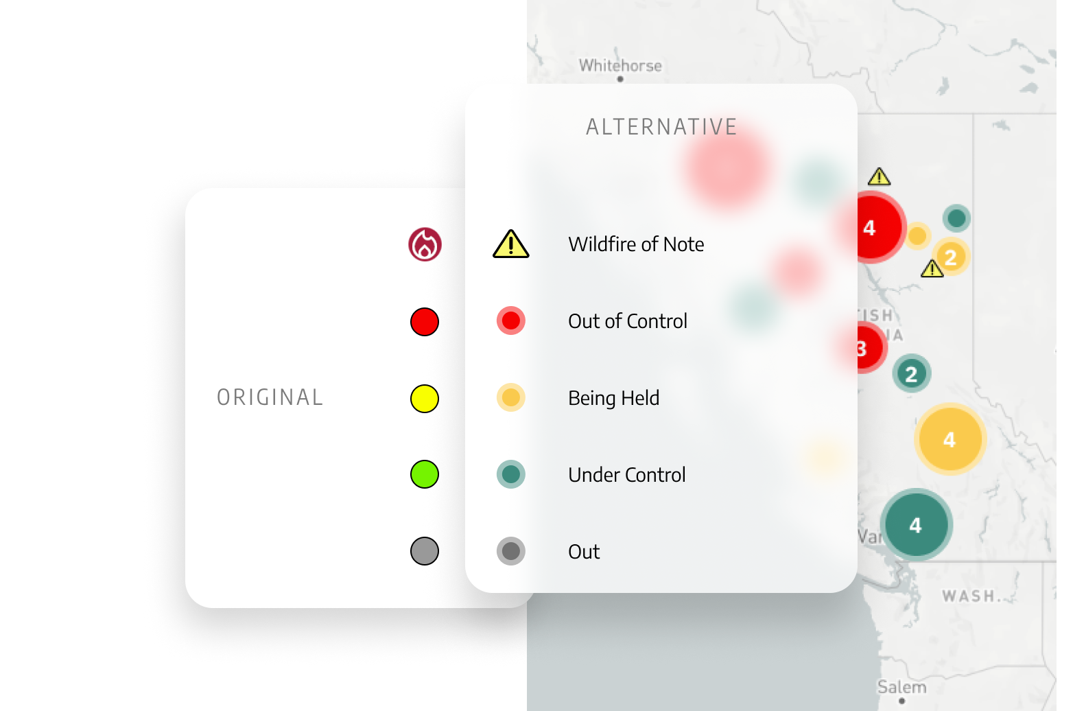
- Size: Map Legend is being too small for users to tap on, I have increased its size to ensure better usability and ease of interaction.
UX
Unclear map navigation icon
![]() Layers and
Layers and ![]() Map type icon is very unclear, I opted to combine them into a single icon representing
Map type icon is very unclear, I opted to combine them into a single icon representing ![]() Settings on the top of the screen next to search for enhanced clarity and simplicity.
Settings on the top of the screen next to search for enhanced clarity and simplicity.
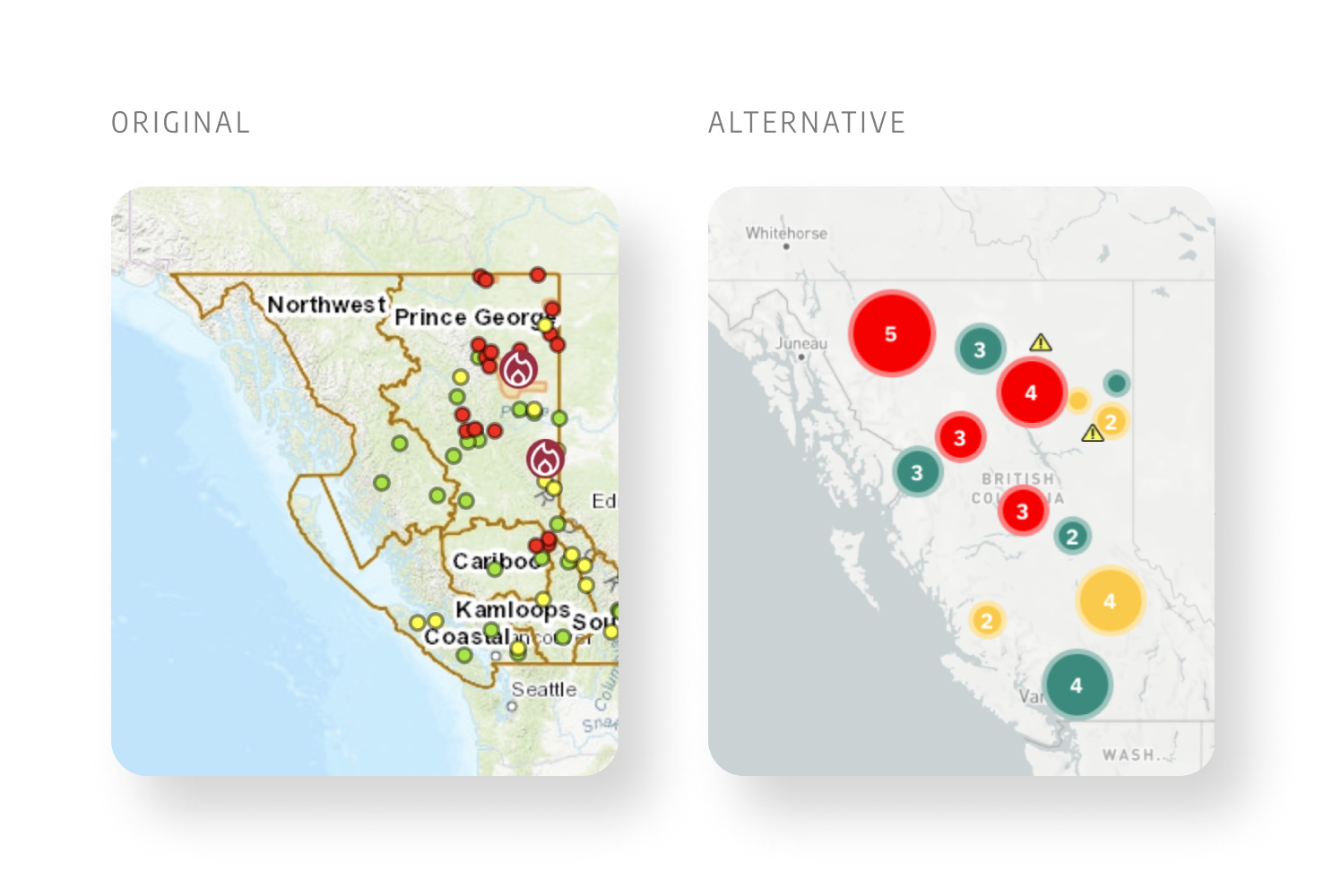
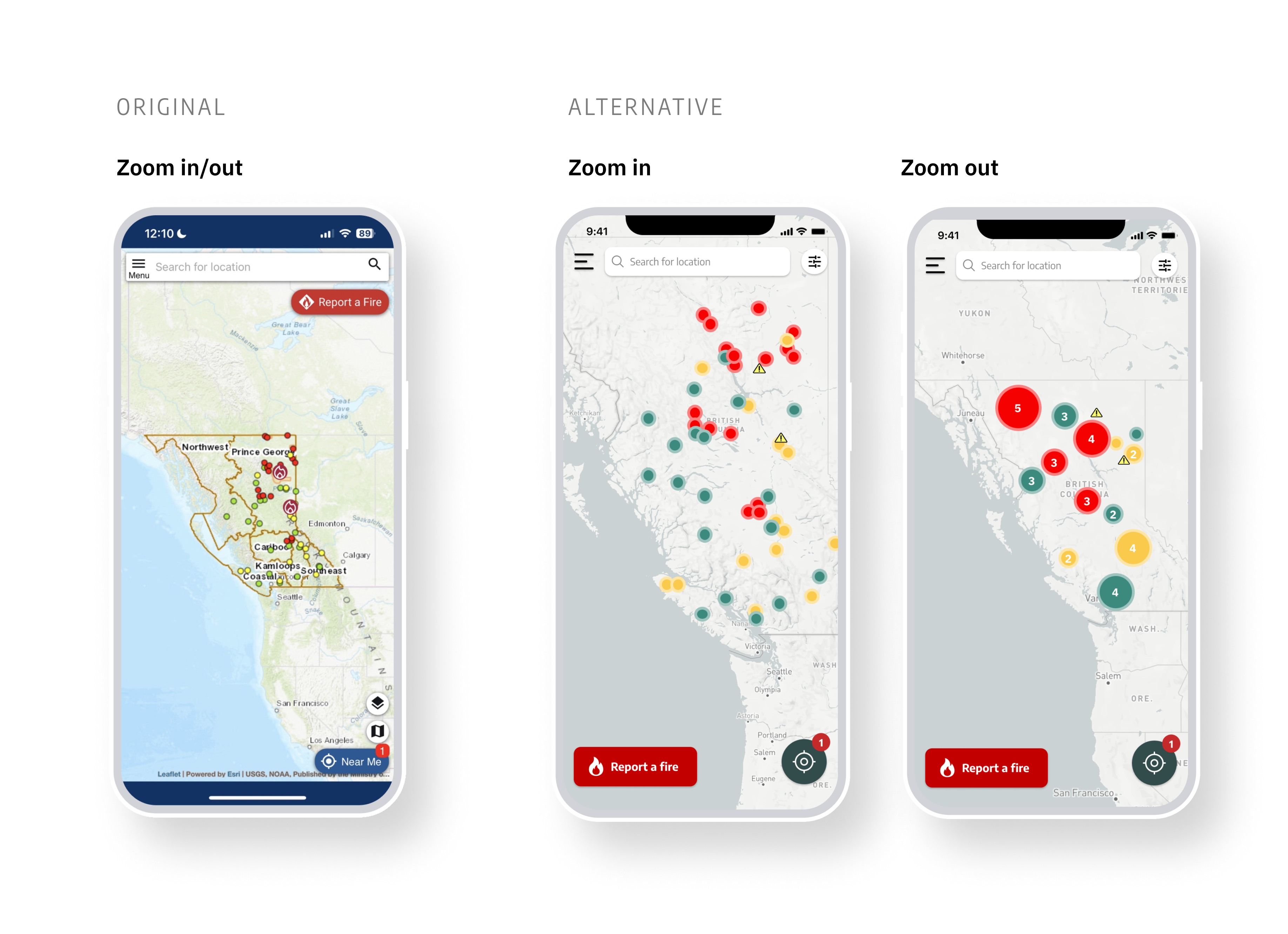
Wildfire location (zoom in/out)
In order to improve usability when zooming out, I simplified the wildfire location symbols. Users can now zoom in to see specific locations and obtain more detailed information.
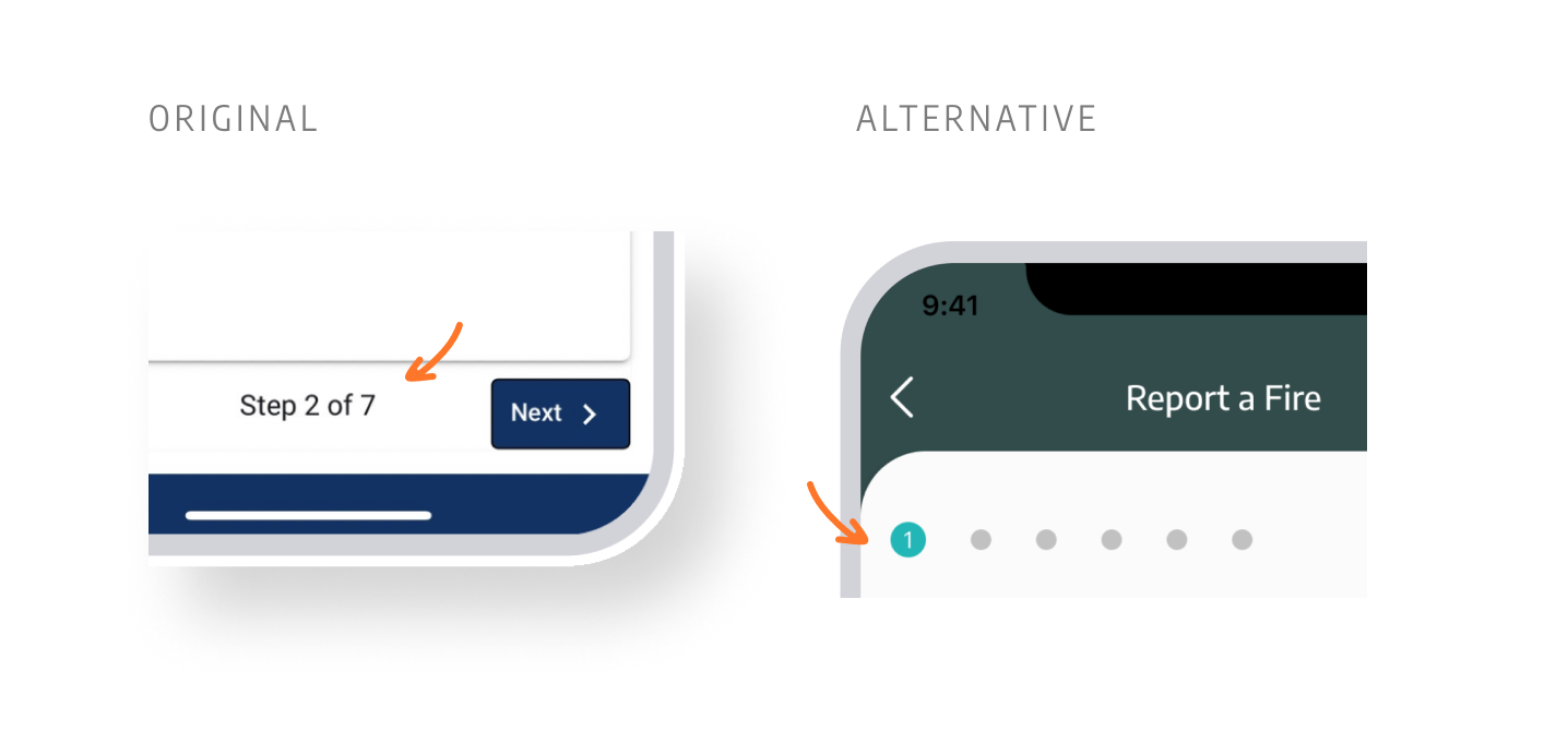
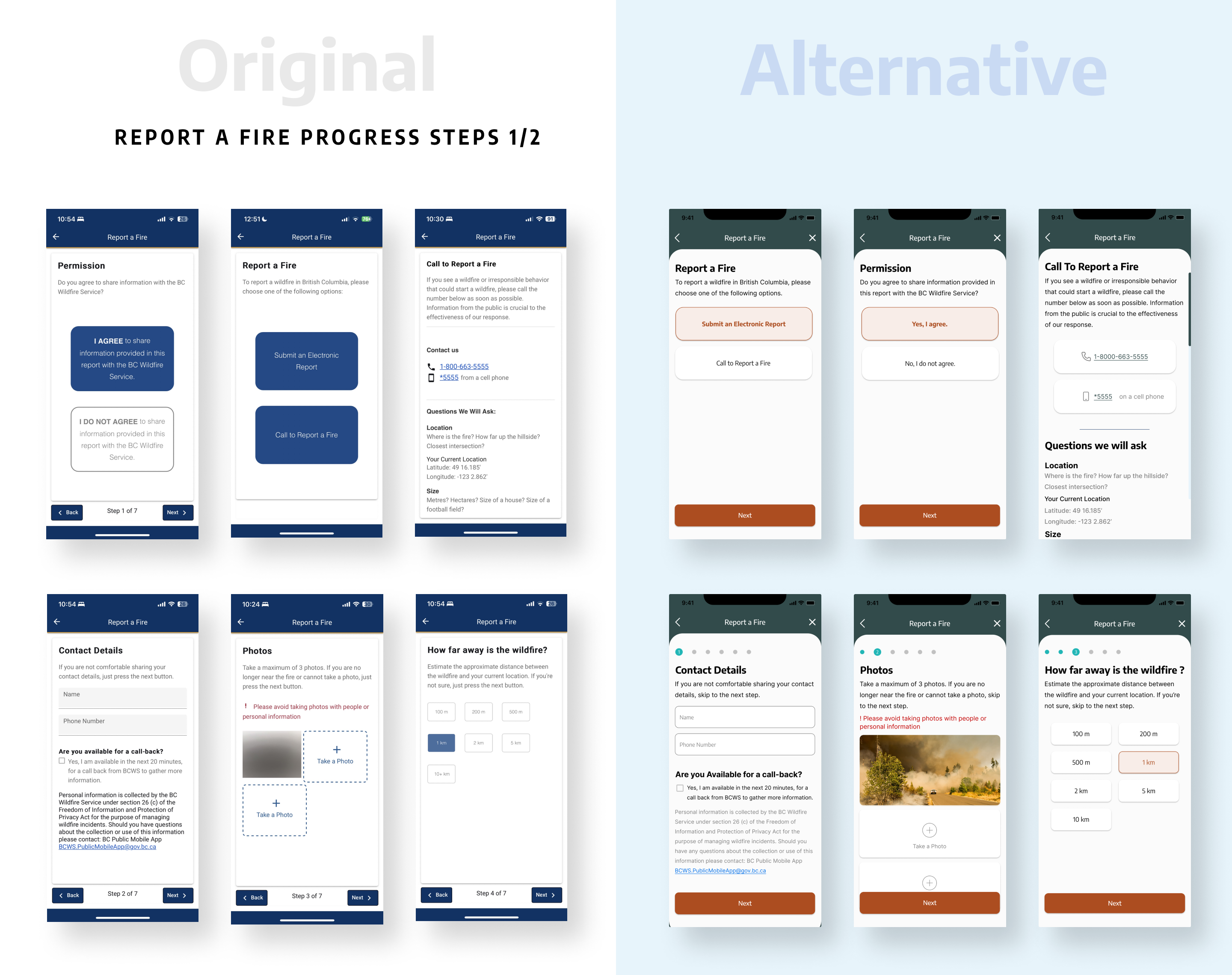
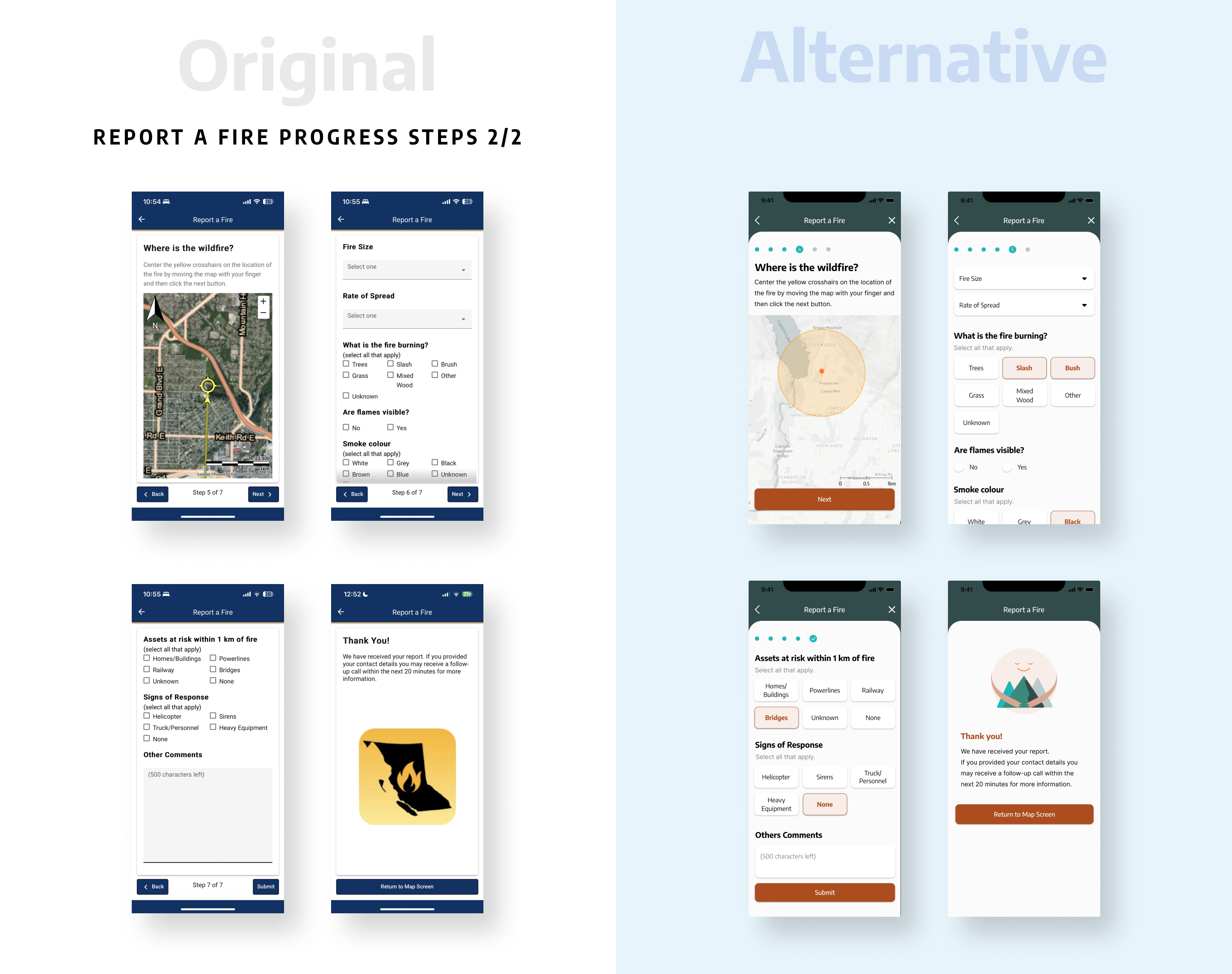
Progress steps
redesigned the reporting process by implementing a modern design approach. The steps have been simplified, and the layout is now more intuitive for users.
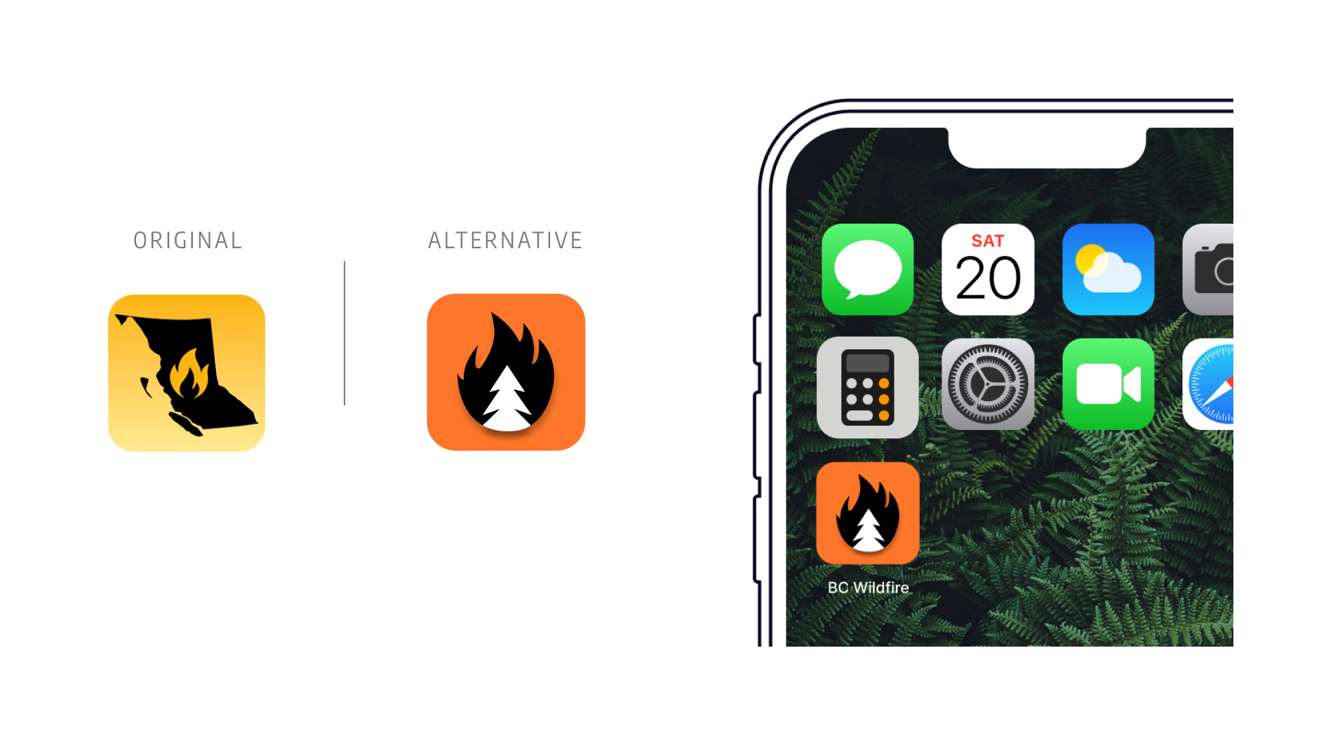
App icon
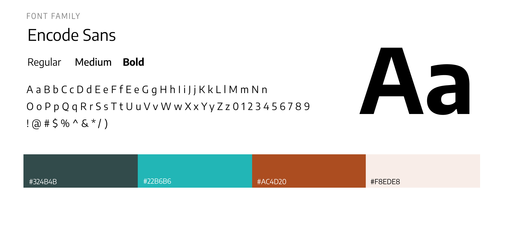
Typography and Color palette
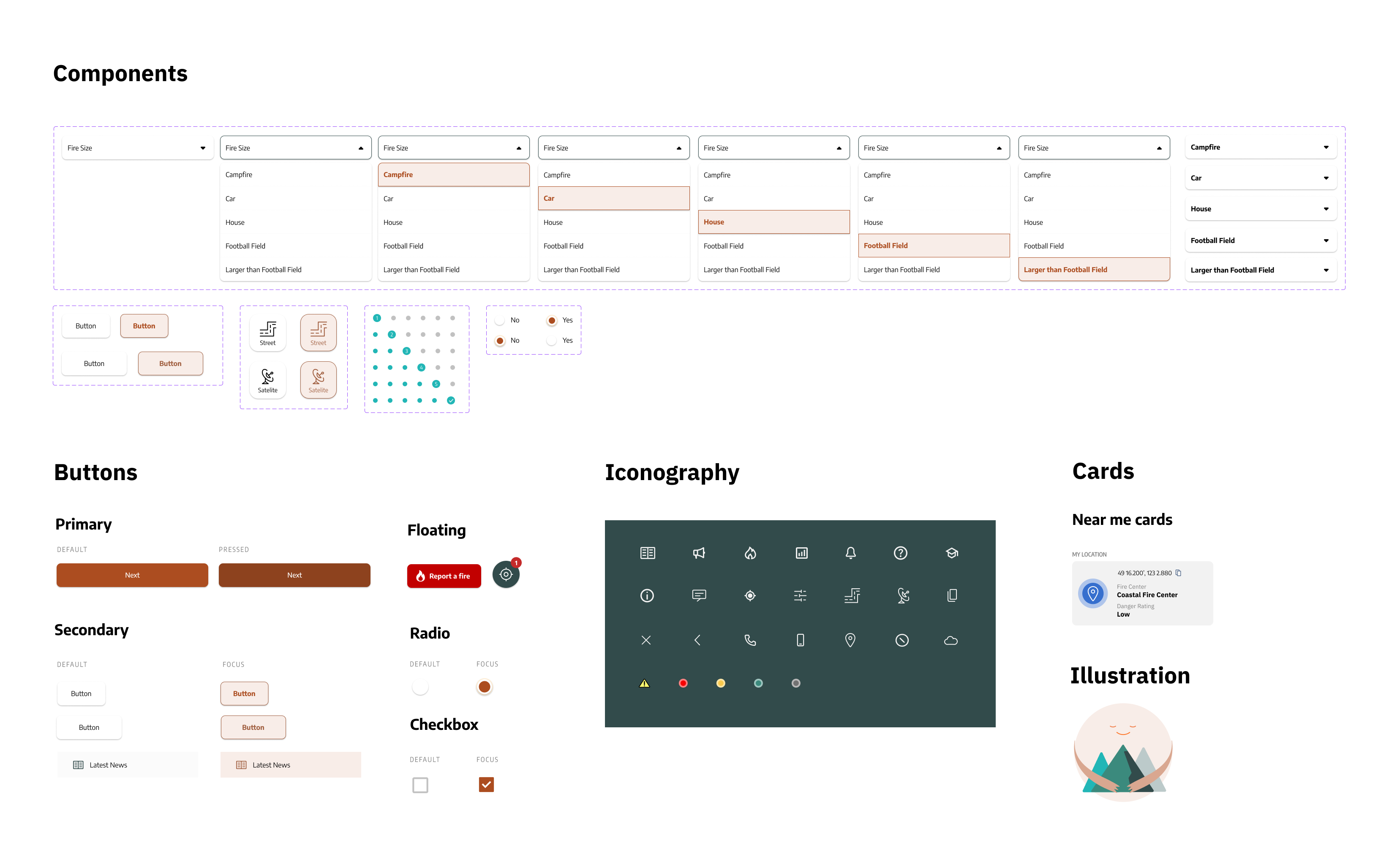
UI kit
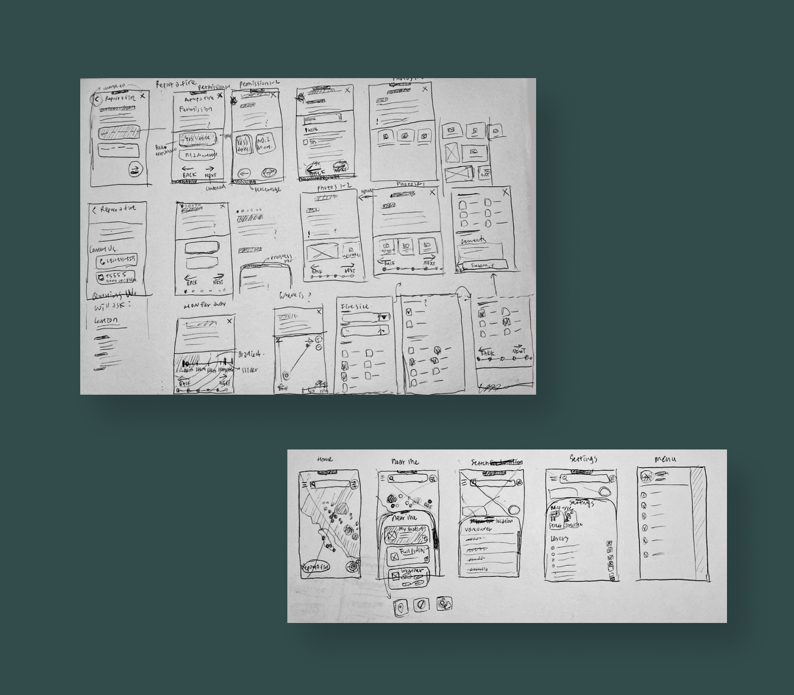
Wireframes
Prototype
Alternative VS current design
Tool used