About the Project
Kitzsteinhorn Glaciers, a ski resort website with a low legibility typeface and uses a very odd type scale (too big on the titles and too small in some contents). Further, the navigation on the responsive screen makes the user challenging to read with the small icons and titles.
Constraints: No changing branding, color palette, and content.
Problem Analysis
Redundant icons
The same icon appears twice on the navigation and some unnecessary icons make the page looks cluttered and unclean.
Typeface & Type Scale
There are three different typefaces on one page which make the users distracted and confused. The typeface used for the title is hard to read. When the user is hovering over the images, the title is unreadable with a bright background image. The type scale on the page is either too big or too small, the users have to scroll so far down to be able to read the whole content.
Inconsistent header & buttons
Some buttons are styled with dotted outlines whilst some are solid outlines with different sizes. Some pages’ header styles are different than others.
Unclear UI
The UI of the voucher purchase page is not easy to understand where to click and type the message. The quantity input section is not specified and it’s not in the right place so it’s very confusing.
Content Hierarchy
The hierarchy on the annual ticket page is very unclear, the users will get lost easily and find it difficult to perceive the information.
UI Kit
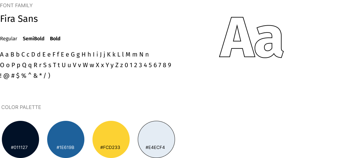
The original typeface is not friendly in terms of legibility. I changed the typeface entirely to Fira Sans, it’s a sans-serif font so it’s easier and cleaner to read.
Current and alternative design
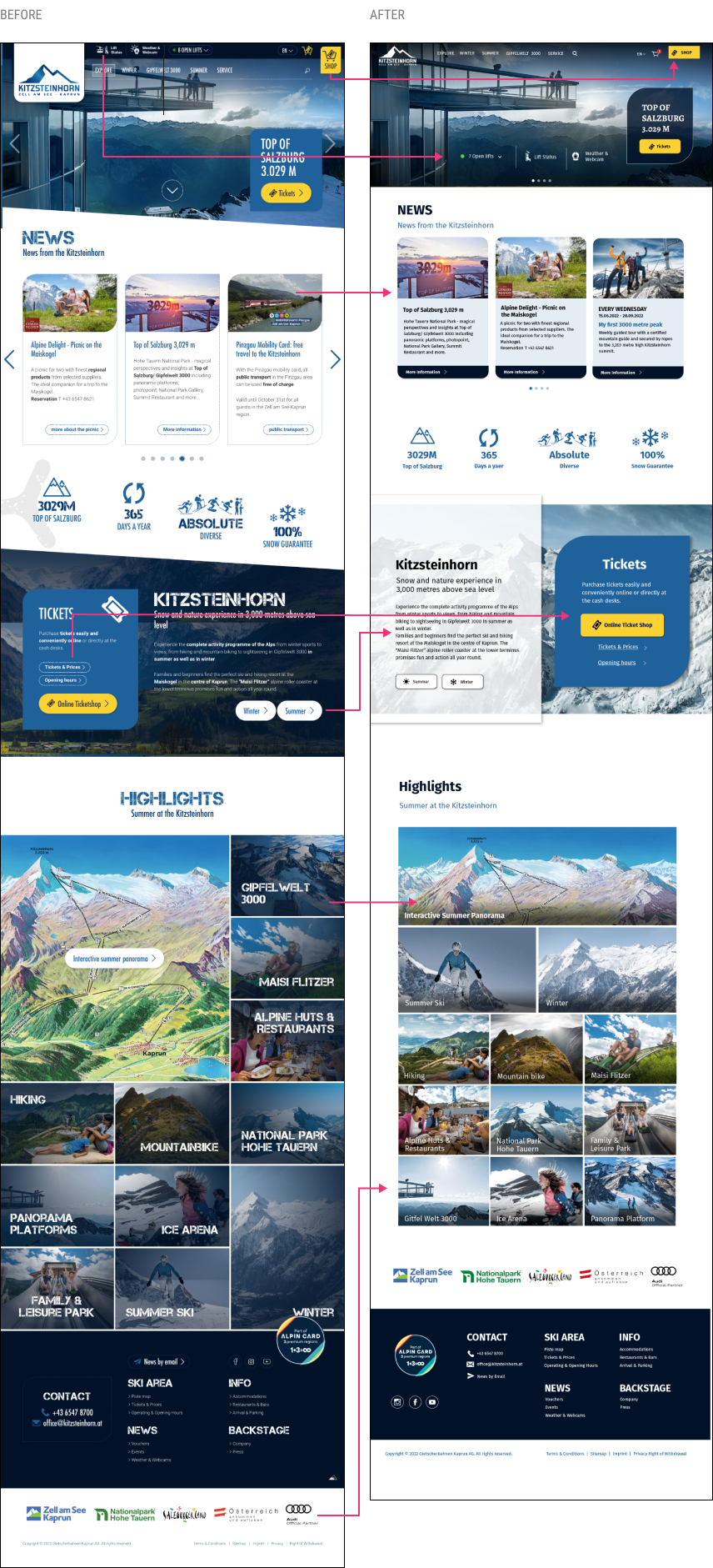
Home page
The same shopping cart icon appears twice, so I removed one and changed the Shop button to align with the cart. Too many icons in the navigation. Moved the top navigation in the header so it looks less cluttered. The titles in each image are illegible while hovering in the highlight section, therefore I added a gradient overlay background for the titles.
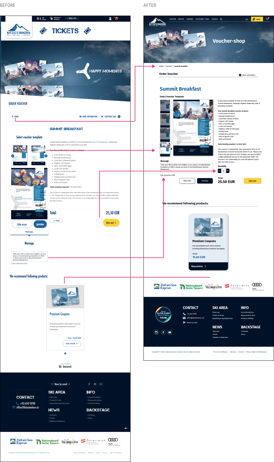
Voucher shop
- Used breadcrumb menu to replace go back to the voucher page as well as to keep the consistency as their other pages have breadcrumb menu.
- Added the quantity section because the original design only shows a box with input numbers which is uncleared. Changed the arrangement of selecting the voucher template to an easier-to-understand design as shown. It also eliminates unused white space.
- The users can see all four options on the left side instead of hiding with arrows on the top of the preview image.
- Aligned all buttons and removed the unnecessary go-back button to make the page look neater.
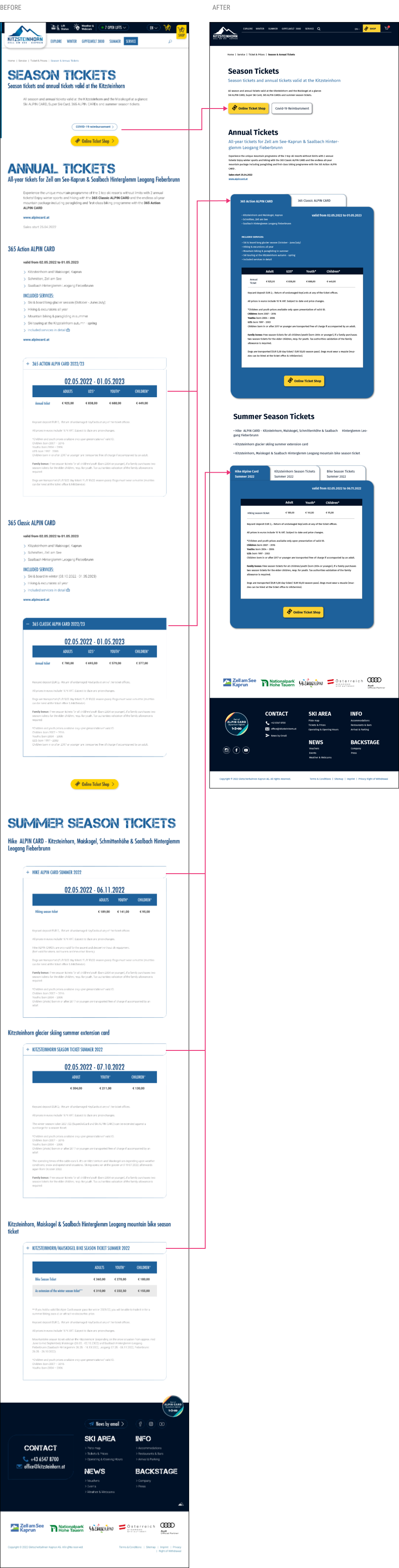
Tickets
Changed the font scale and the buttons due to the poor hierarchy, the users will easily get lost on this page. Organized the ticket information into tabs so the users don’t have to scroll too far down to find the information they need.
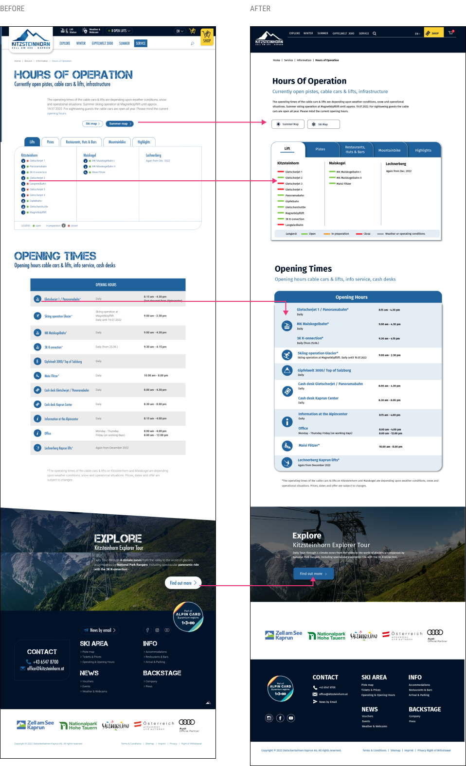
Hours of operation
Changed the buttons to the same style to keep consistency. Removed small icons to avoid clutters and improve legibility. Reorganized the icons to group the same content so it’s easier to find the information needed.
View mobile screens