AdventureBC Web Design

Overview
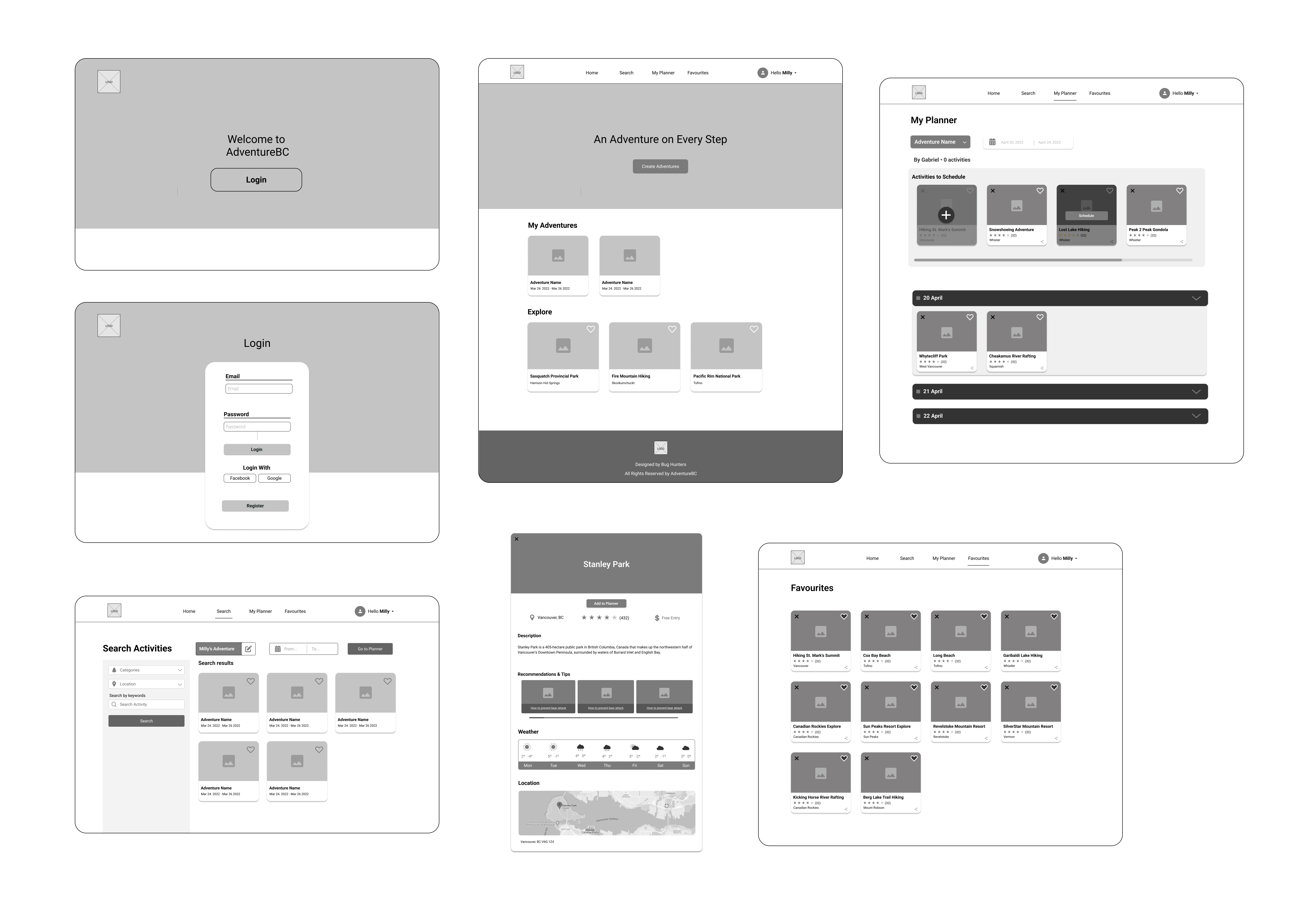
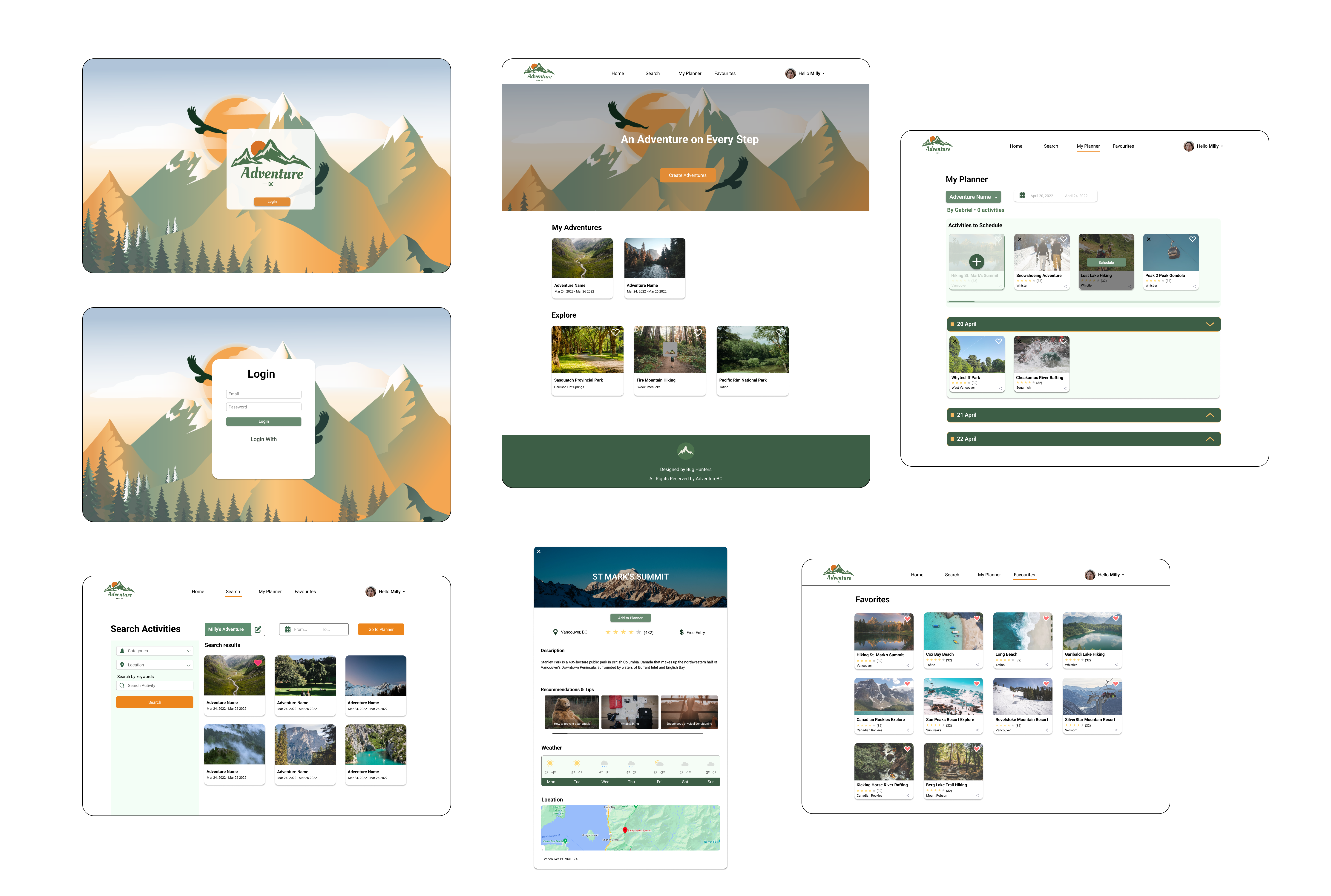
In this project, I collaborated with a team of four developers and three designers over the course of 12 weeks. As the design lead, my responsibilities included assigning tasks and coordinating with the other designers to ensure alignment. I took charge of various aspects, such as creating lo-fi wireframes, developing branding, designing the UX/UI, and conducting usability testing.
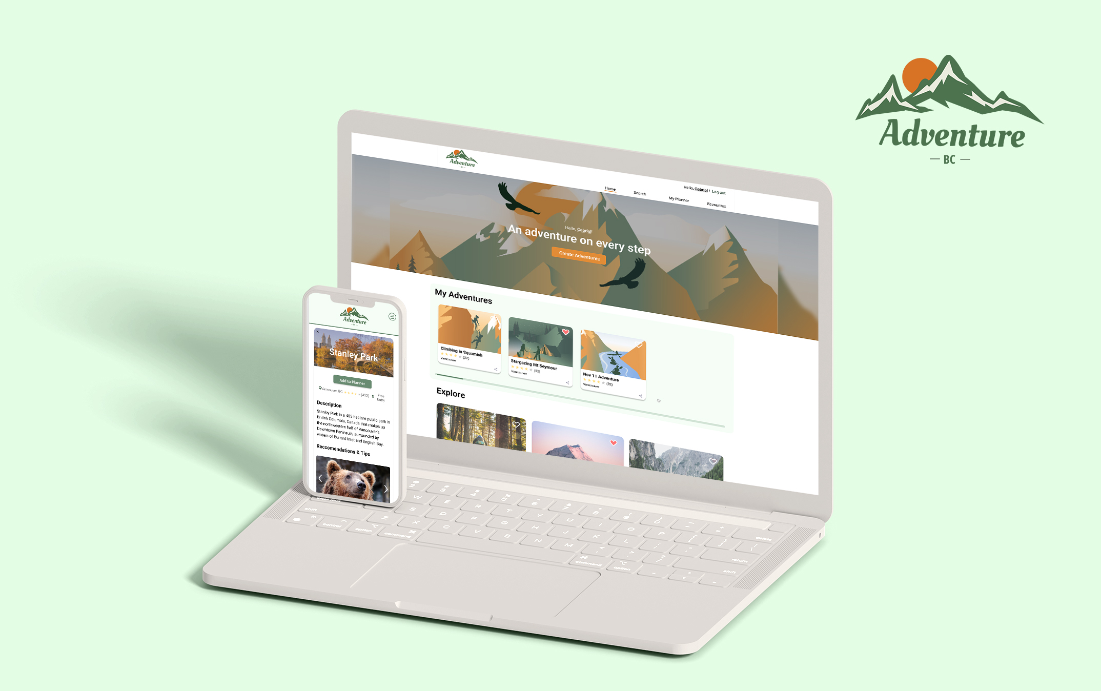
AdventureBC is a website for anyone looking to explore the natural wonders of British Columbia, whether they are a first-time visitor or a local resident. It provides personalized tips and recommendations for adventurers of all levels, helping users make the most of their trips no matter where they’re starting from. AdventureBC allows you to easily organize and plan your trips, discovering hidden gems and breathtaking sights.
Features

Logo
The design of the logo draws inspiration from the mountains that grace the skyline of North Vancouver, as well as the vibrant colors of a sunset over the nearby beach. By combining these two natural elements, the logo captures the essence of adventure and relaxation that can be found in British Columbia.

Typography & Color
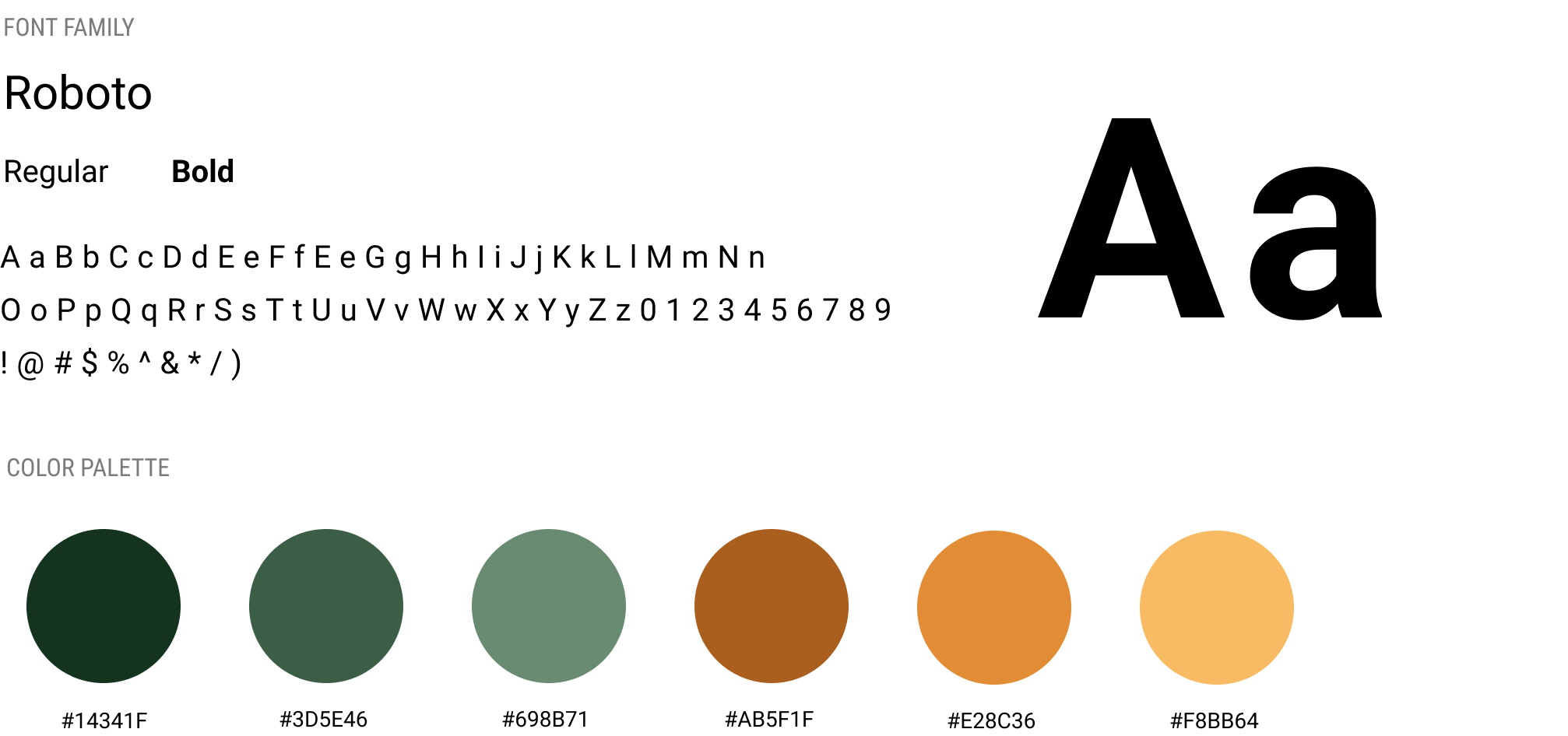
The primary and secondary colors of the logo are various shades of green and orange, which were chosen to symbolize both the lush forests and the vibrant leaves of British Columbia’s natural landscape. The use of these color also evokes a sense of warmth and and energy, reflecting the dynamic spirit of adventure and exploration that can be found in the region.
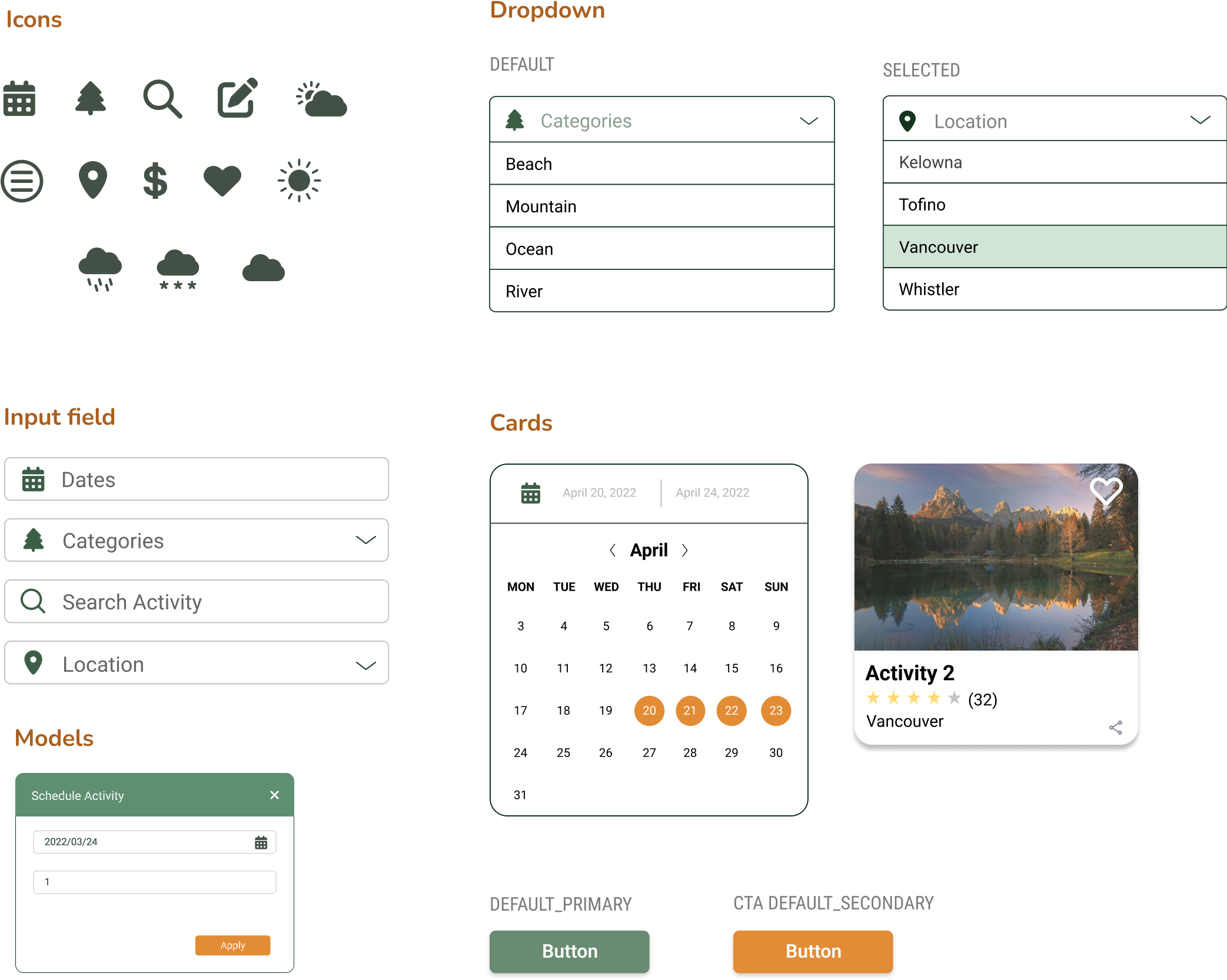
UI Kit
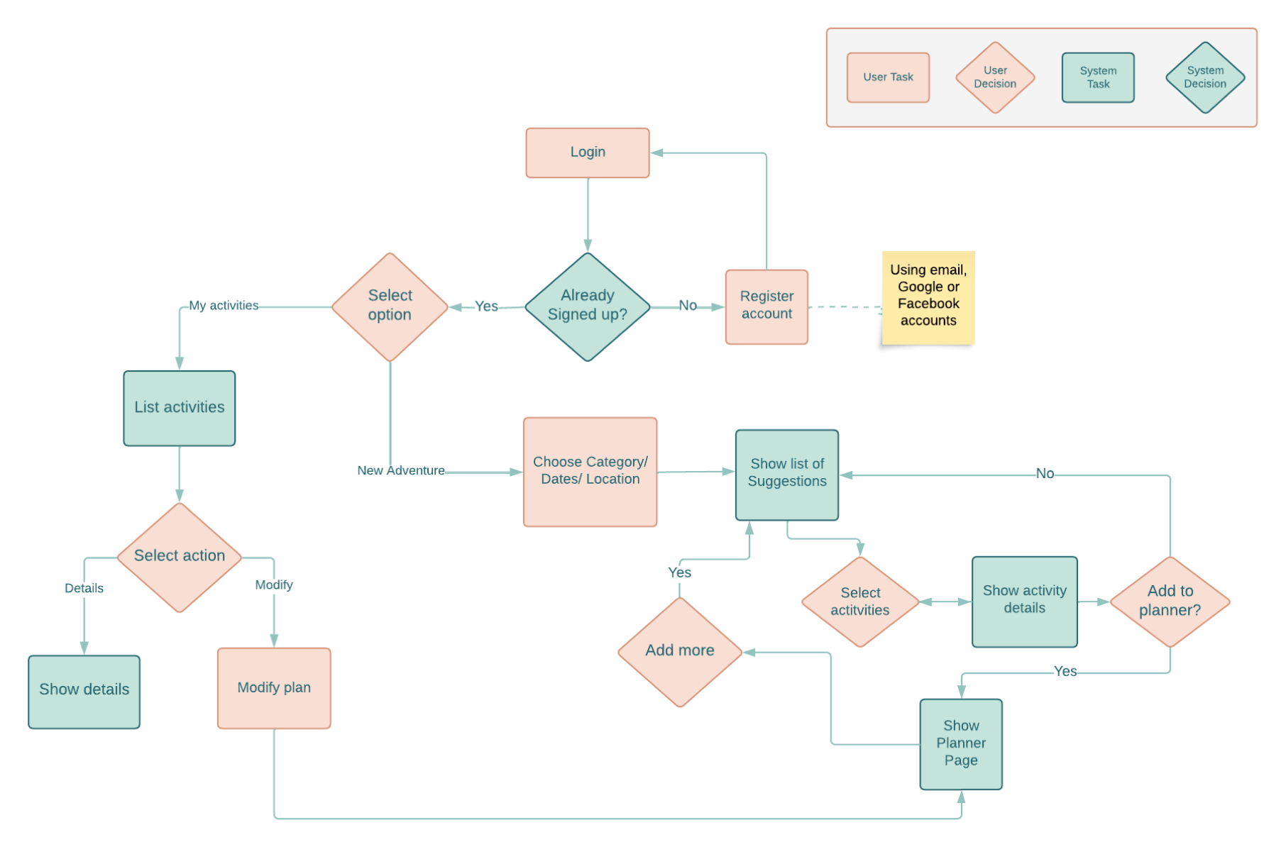
User Flow
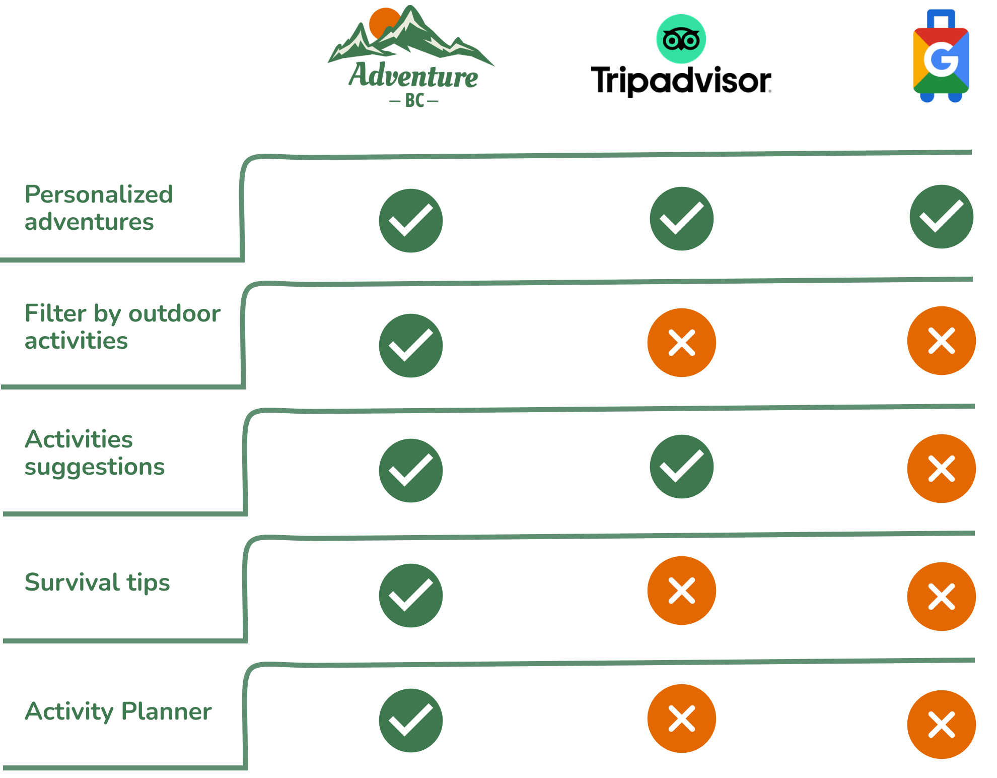
Competitive Analysis
Wireframe and Mockup
