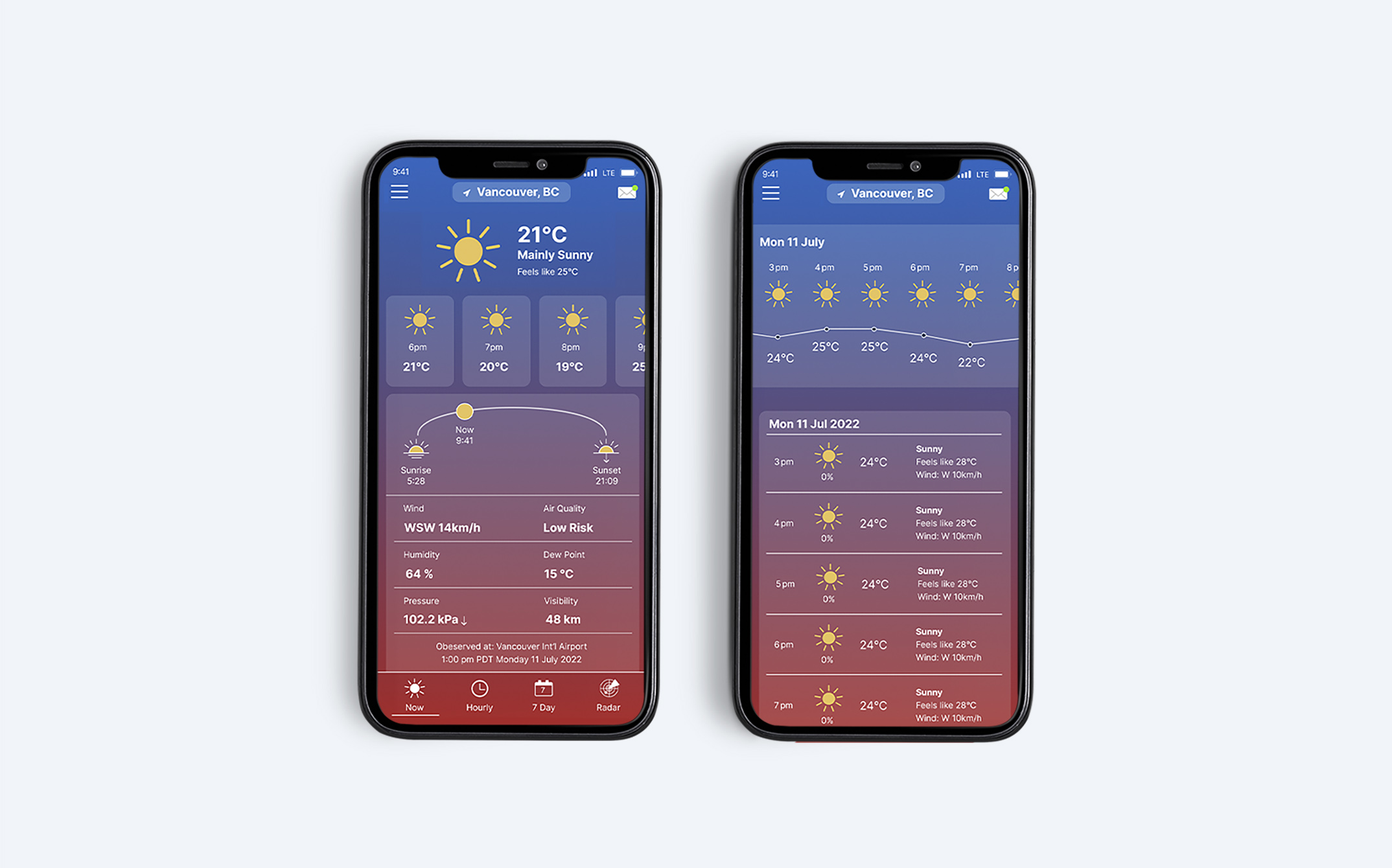
WeatherCan Mobile App Design Study
About the Project WeatherCAN is a weather app that allows users to check hourly forecasts, seven-day outlooks, news updates, and radar maps. For this redesign, I applied a glassmorphism style to give the interface a modern and clean look. I kept the original blue as the primary color and introduced a soft blue-to-red gradient background […]
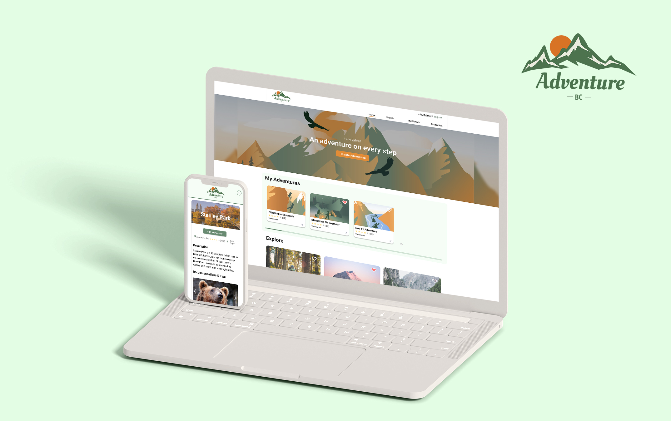
AdventureBC Web Design
Overview In this project, I collaborated with a team of four developers and three designers over the course of 12 weeks. As the design lead, my responsibilities included assigning tasks and coordinating with the other designers to ensure alignment. I took charge of various aspects, such as creating lo-fi wireframes, developing branding, designing the UX/UI, […]


